Magnolia Lane DSP

Magnolia Lane card

I realize that this Designer Series Paper isn’t available to order until June 4th, but I just had to share this project with you. I love the designs and patterns that come in the Magnolia Lane Designer Series Paper and can see it being well used over the next year!

For this card I really wanted to feature the Designer Series Paper, so I kept it fairly simple. I used the DSP as a card mat and instead of adding another layer of cardstock for stamping, like I often do in my other projects, I simply chose a phrase from the Free As a Bird stamp set (which will also be available on June 4th) to have on a small piece of cardstock.

The colours I chose specifically because they are used in the Magnolia Lane DSP… I used Mossy Meadow cardstock and ink, Petal Pink cardstock and ink as well as Whisper White cardstock. I also added a couple of  Rhinestone Basic Jewels to add just a little bit of sparkle.

Here’s the project sheet and if you haven’t received your copy of the Annual Catalogue yet, send me an email (inkspirationwithteresa@gmail.com) and I’d be happy to get one to you!

Magnolia Lane Project Sheet

Pokemon Birthday Party

Pokemon buckets

It was my littlest munchkin’s 6th birthday party this past weekend and he’s gotten super into Pokemon, so that was the theme this year. A couple of weeks ago I shared the invitations that I made for the party (check it out here) and now I’m sharing the rest.

I kept it pretty simple since the party was being held at a trampoline park and it was for 5/6 year old boys (my daughter’s birthday coming in October will be a very different story).

For decorations I printed some Pokemon characters and symbols on Whisper White cardstock to create the buckets above. The buckets originally were used for my daughter’s emoji birthday party and they worked out great, I’m so glad I saved them.

Loot bags wm

For the loot bags I used the Gift Bag Punch Board (which sadly is retiring and won’t be available after next week) and created medium sized loot bags that looked like Poke-balls using Real RedBasic Black and Whisper White cardstock. For the circle in the middle I used the 2 1/4″ Circle  and 2″ Circle punches and the “thank you” came from the retired Tin of Cards stamp set.

I really love how they turned out (and so did my youngest munchkin) and they were so simple to make. They added a great touch to the pretty basic party room that we were in and even some of the parents thought the loot bags looked cool.!

Loot bag wm


You Warm My Heart

Warm My Heart wm

I scaled back a bit on this week’s project… got back to some #simplestamping and only added a few pearls and a couple of dimensionals to add a little bit of pop. I have definitely had fun creating with this stamp set (Bike Ride) because it lends itself well to the idea of just using paper, stamps and ink and will be sad to see it go! This may be one that I hold on to so that I can still play with it every once in a while.

The two main colours I used for this project are Rich Razzleberry and Lemon Lime Twist (the cardstock has sold out already but you can still get the ink pad and other embellishments in Lemon Lime Twist). For some reason I just love how greens and purples compliment each other. It isn’t a combination that I would have naturally thought of, but once I saw it I just love going back to it.

I also used Crumb Cake for the basket and dog as well as Tuxedo Black Memento for the bicycle. The phrase and grass came from the Sheltering Tree stamp set which is also retiring (this might be another that I hold onto even after it retires in just over a week). On the flowers I added some of the Share What You Love Artisan Pearls just to add another layer and a bit of a different texture to the project.

For all the supplies, steps and tips to recreate this card for yourself simply check out the project sheet. And don’t forget to post a pic of your project!

2018 May Bike Ride Sheltering Tree

Enjoy the Little Things

Michaels Bike

A few weeks ago when I was wandering around Michael’s (a seriously dangerous thing to do) I saw this and immediately thought of the Bike Rise photopolymer stamp set and thought that it would be fun to try and recreate this on a card front. While I didn’t have a stamp that said “Enjoy the Ride” I think I came pretty close (I used one from the previously retired Enjoy he Little Things stamp set).

The main colours I used for this card are Crumb Cake and Mint Macaron (cardstock and inkpads). I also used Pool PartyPetal Pink and Fresh Fig for the butterflies (which came from the Beauty Abounds cling stamp set) and some of the flowers. I also used the Pinewood Planks Dynamic Textured Impressions Embossing Folder to give a bit of a paneled look.

Enjoy the Ride wm

For all the tips and tricks to recreate this project check out the project sheet. Don’t forget to share your project once you’re done, I’d love to see it!

2019 Bike Ride Project Sheet

Where Do I Start?

where-do-i-start

I don’t know about you, but at times it can feel daunting when I know I want to create something.. especially when I’m not sure what that might be. So in the spirit of sparking some inkspiration for all of us crafty people out there (and those that are just starting out), I thought that I would share some of what I do when I’m looking to design and create a card/project!

First things first…

Images

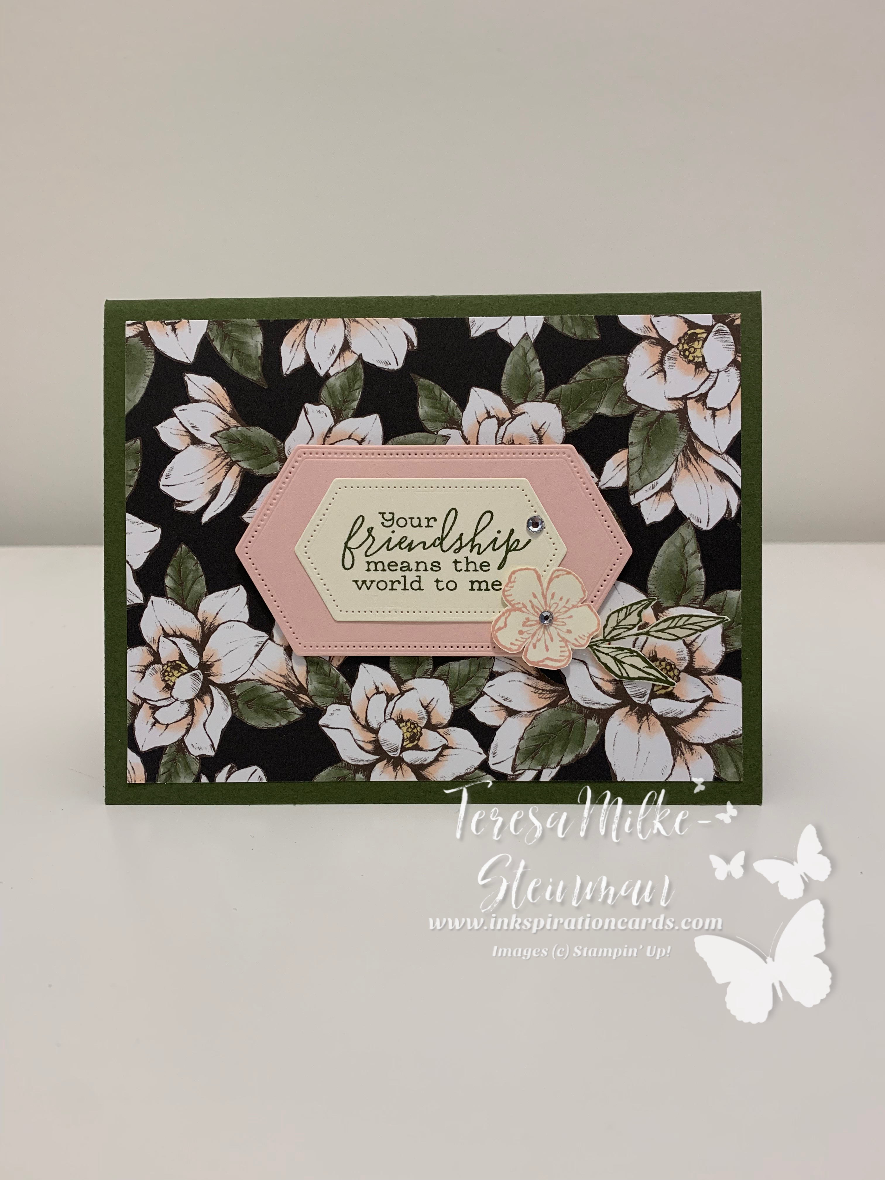
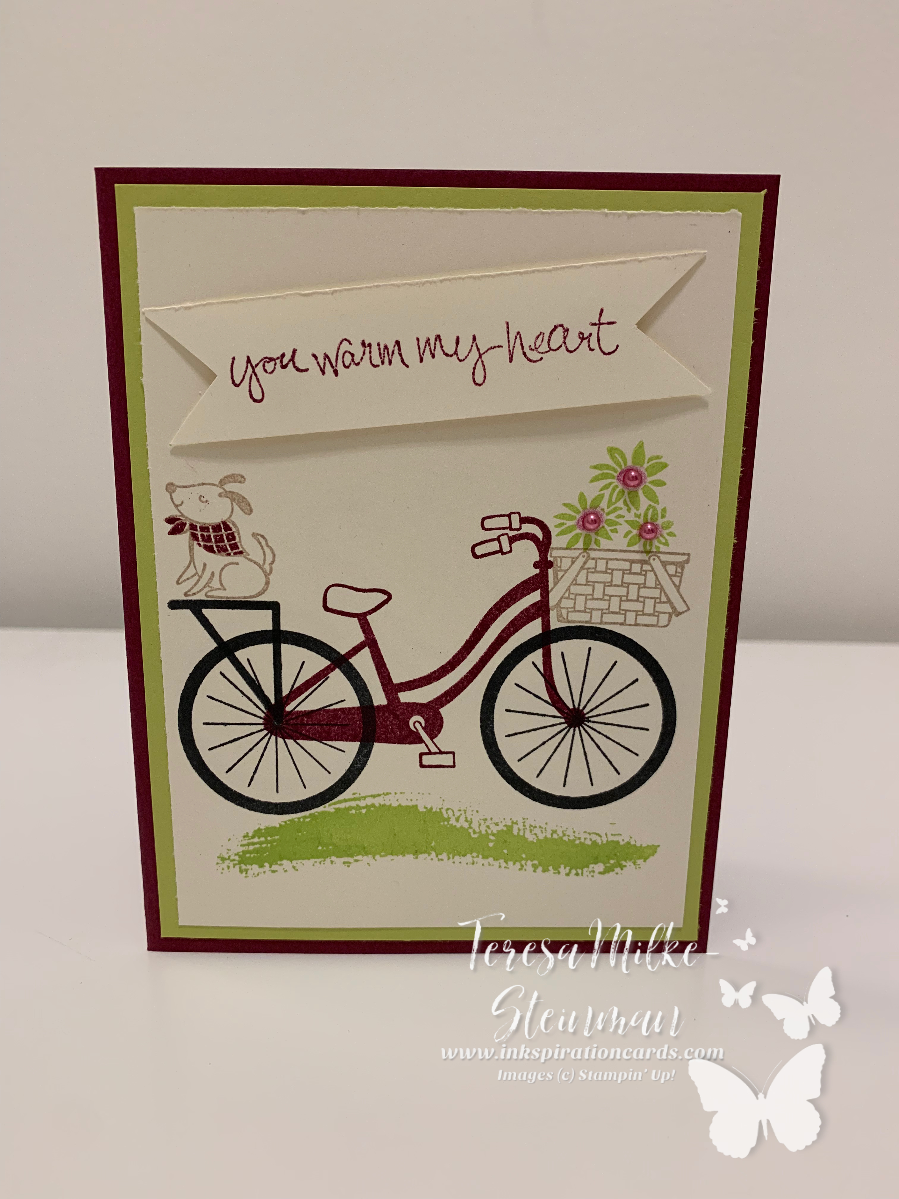
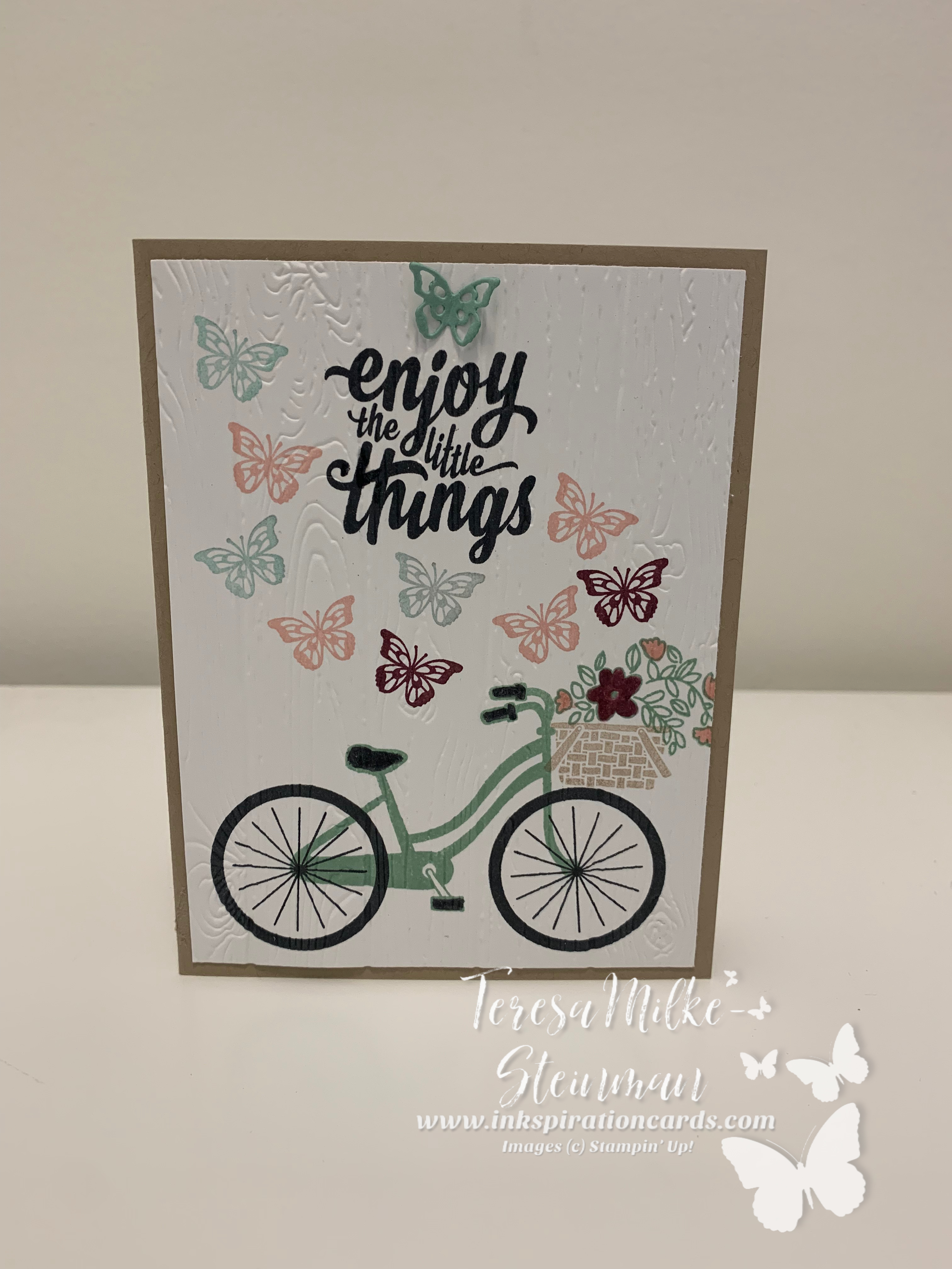
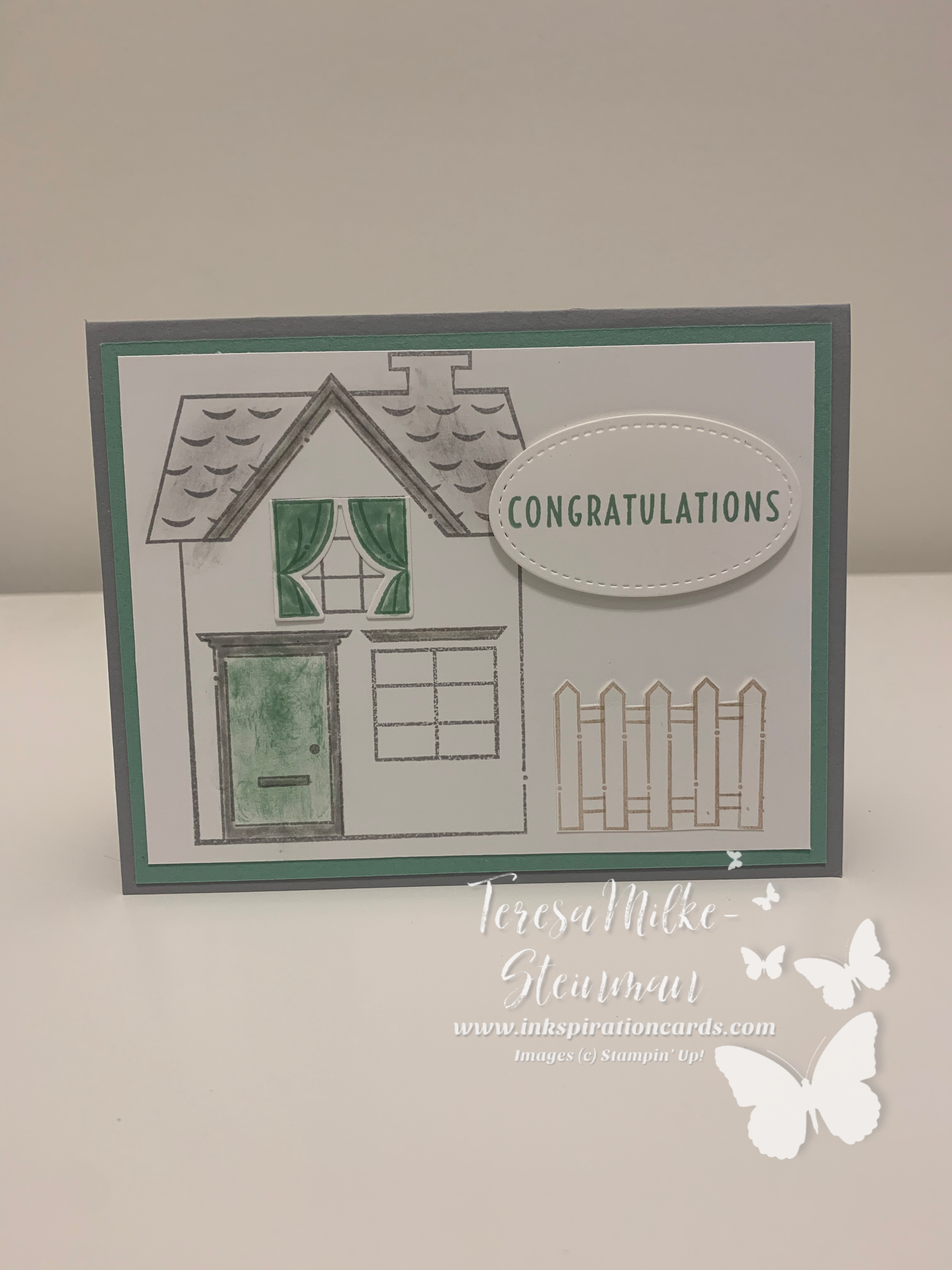
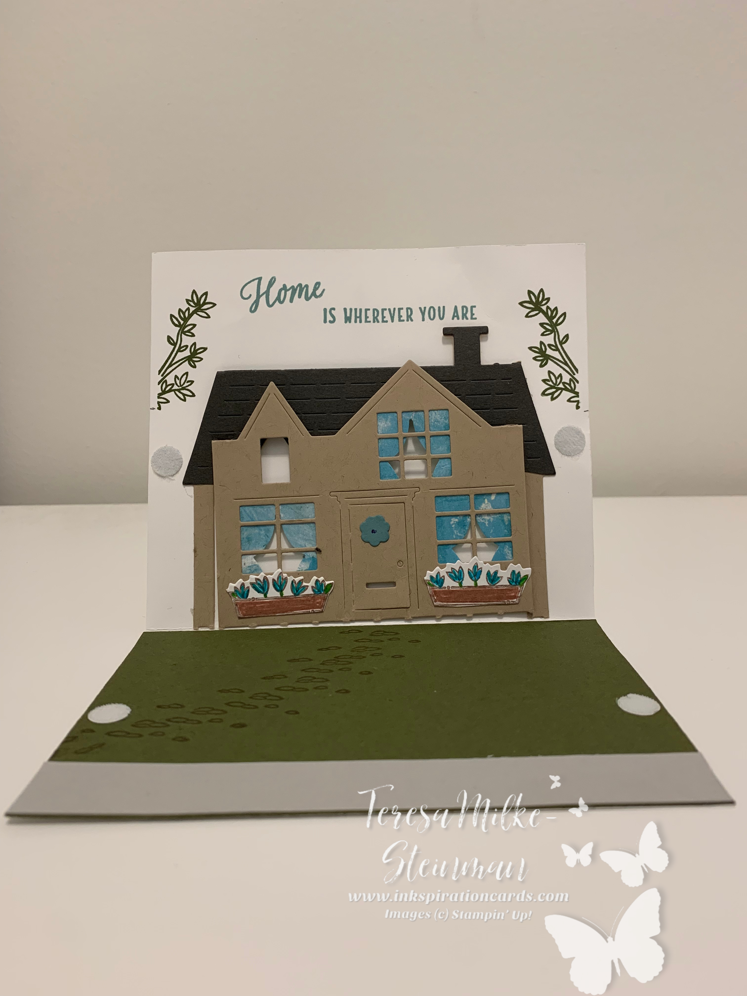
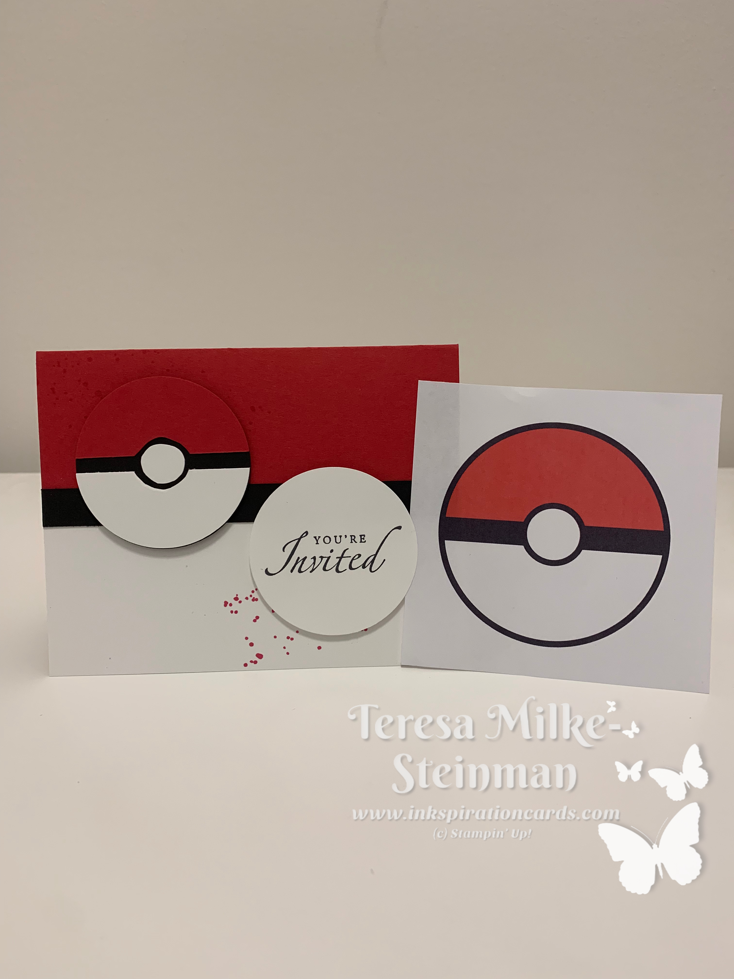
One of the best places to start when creating a project is with the image(s) you want to use, so think of what images you are drawn to. If this is a card for someone you know, think of what images would speak to them. In the case that this is for a particular event or occasion then that would likely guide your choice of image(s), for example a birthday cake or balloons for a birthday card. At times the image(s) I choose ends up helping me in my choice of colour(s) and other elements for the project.

Balloons

Words/Phrases

You want to take into consideration what message you want to convey to the person you’re giving this to, whether this is for a specific occasion or just because. Do you want just a simple word or two, or would a sentence or phrase be better able to say what you want.

Colours

This can be done at any point in time during the creative process. Sometimes I start with choosing the colours and at other times they come once I have a better picture in my head of what the project is going to look like.

No matter when this happens, this is similar to how you choose your image(s). Take into consideration what your favourite colour(s) is and what colour(s) compliments it. If the project is for someone else consider what their favourite colour is. The season you’re creating in or the occasion your creating for may or may not play a role in this decision.

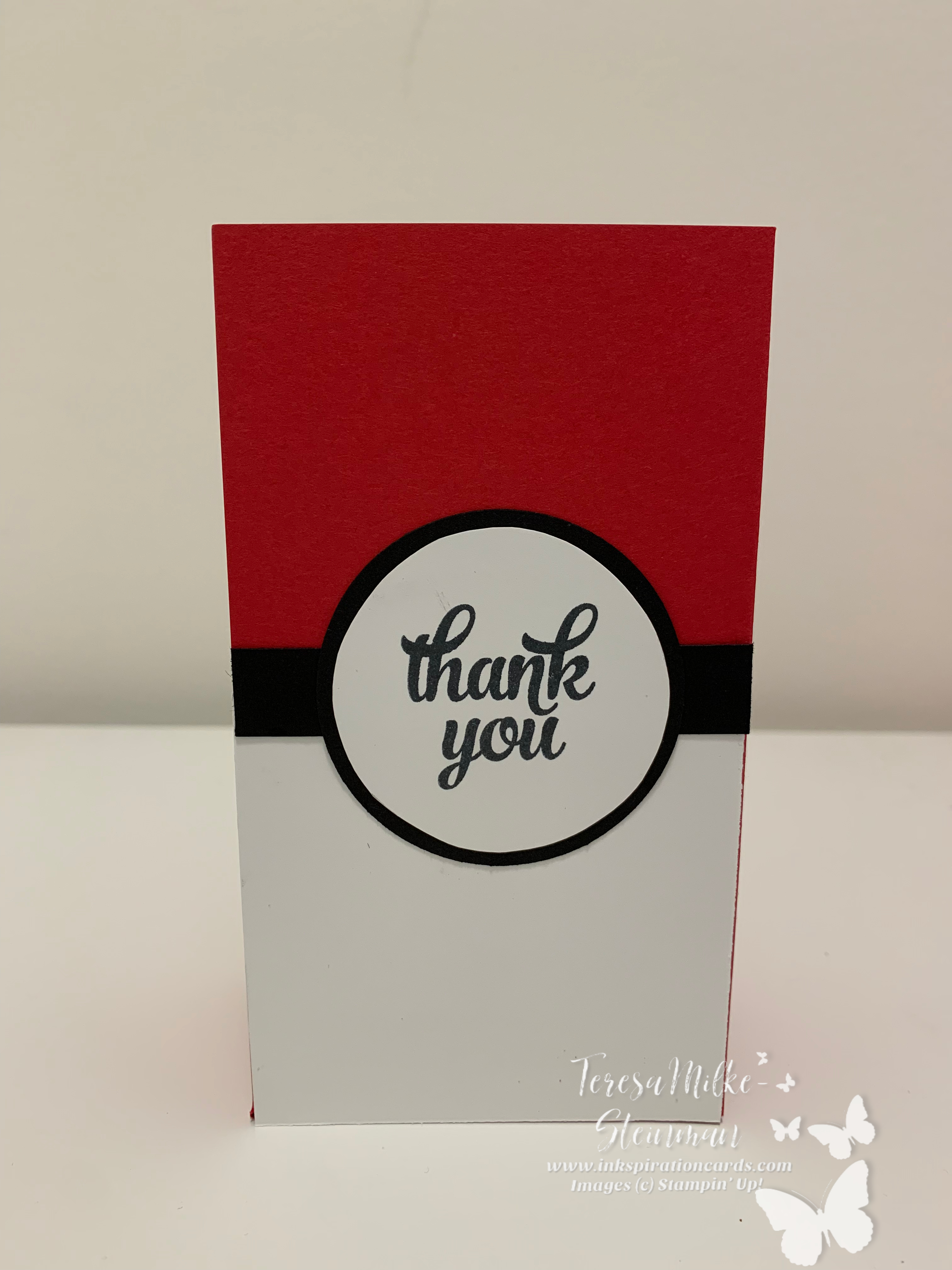
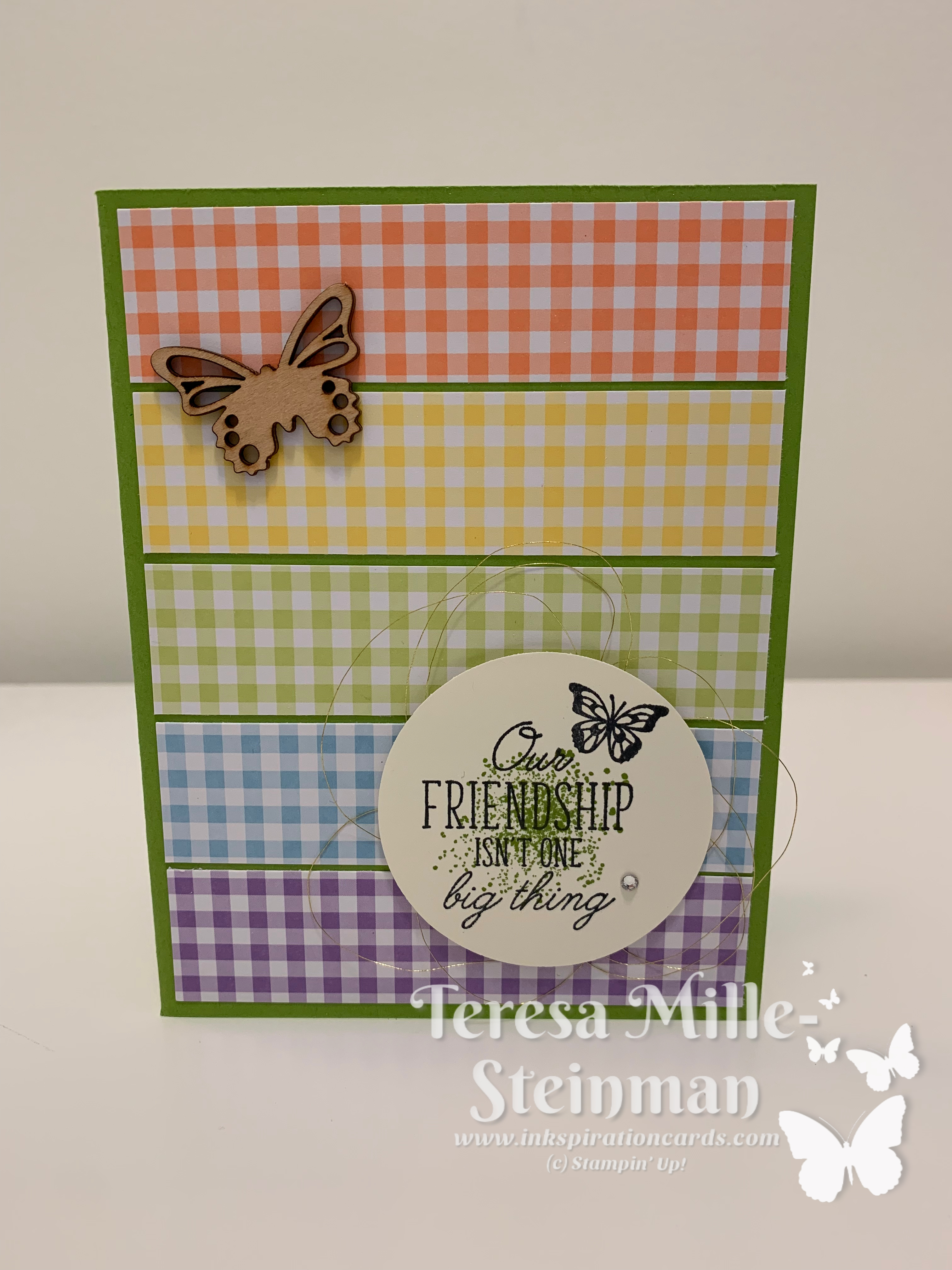
More often than not I use the 2 Colour Rule, which means that you use two colours for your card or project. These two colours are then seen throughout the project with the cardstock, ink and the embellishments. The only exception to this rule is when you use a neutral colour as your third colour; black, white, grey, brown, navy as well as metallics.

colour

If you want to stop there you can or you can also look at bringing in other elements to take your project from a #simplestamping project to one with a little bit more zing.
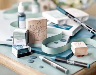
Embellishments

There are many options if you decide to take this route and you don’t have to choose just one (although if you are just starting out you may want to start with one and then as you feel more comfortable add more layers).

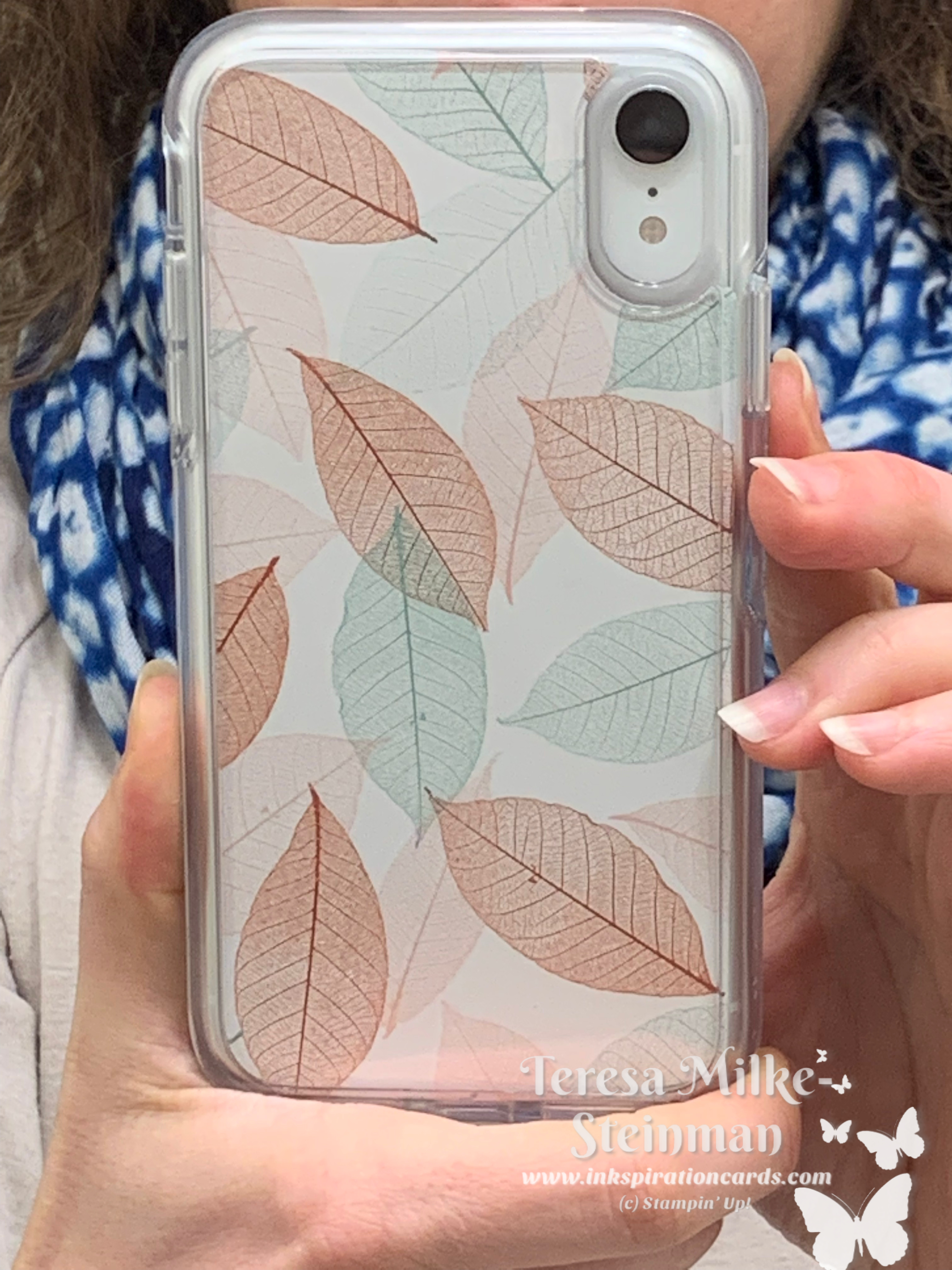
Designer Series Paper is a great way to add pattern and texture to your projects. You can simply add a strip or it could be the background for your images/words.

Adding ribbon/twine will also give similar effects and options for both are never in short supply!

And of course there is always one of my favourite ways to add a little something extra to a project… a rhinestone/jewel or glitter gives such sparkle and shine to projects and you don’t need to add a lot.

stampin up party

I hope that these tips have been helpful to get those creative juices flowing and don’t forget there’s a lot around us everyday that can spark an idea for a project!

Pop On By

pop on by

We have recently closed on our house in Milton (finally!!) and I thought it would be nice to use the Pop On By stamp set to make some thank you cards for those that have helped us through our journey of becoming first time home owners. While I was working on these cards I adjusted the phrase on a couple of them (such as the one pictured above) so that I would have something the next time one of our friends or family members moves.

I usually add some ribbon/twine or sparkle to my cards and the thought definitely entered my mind, but when I saw the final product I felt that it didn’t need more so I just kept it simple. The cardstock colours I used for this project are Mint Macaron and Smoky Slate. For ink I used of course used Smoky Slate Mint Macaron, but I also used Crumb Cake for the fence.

I also coloured and sponged for this project. All in all I think that it turned out pretty well. For all the supplies and instructions you need for this project, simply click on the project sheet.

2019 Pop on By Project Sheet

I also thought that I would share a card that my mom made for me using the same bundle. (there’s some non-Stampin’ Up! product in here as well) There is a lovely sentiment on what would typically be considered the outside of the card and so the baby velcro on the sides is there to keep the card closed.

pop on by 2

Pokemon Birthday Invitations

pokemom birthday with pokeball

So this year for his birthday my littlest munchkin wants to have a Pokemon themed birthday party. I’ve definitely heard him talking a lot about Pokemon and he loves looking at his cards (he’s only going to be 6 so he doesn’t quite know how to play yet) so I wasn’t at all surprised when he shared this.

With this in mind I used the colours and design of the Poke-ball to create his birthday invitations (this will also inkspire the gift bags I make for his friends, so stay tuned).

pokemom birthday

I used Real Red cardstock for the card base and then layered on some Whisper White cardstock and a 1/2″ strip of Basic Black cardstock to give the Poke-ball effect and then I used the 2 1/4″ Circle punch with the same colours of cardstock to create the Poke-balls. I simply cut the Real Red and Whisper White circles in half and then trimmed them down a little bit so that the Basic Black would peak through. I don’t have the 1/2″ Circle punch (which is now on my wishlist) so I simply traced a circle onto Whisper White cardstock and used my Paper Snips to cut them out. Both the Poke-ball and the “You’re Invited” (which is from a retired stamp set) were adhered to the card base using Stampin’ Dimensionals and behind both circles is paint splatter stamped using Real Red ink to add just a little something special to the card. This particular paint splatter came from the retired set Gorgeous Grunge, but you could easily use either the Beauty Abounds cling stamp set or the Artisan Textures stamp set to get a similar effect.

When I showed them to my little guy he just loved them! I can’t wait to see his face on the big day!!

Gingham Gala Butterflies

Rainbow Gingham wm

I saw similar card a while ago, I wish I could remember who posted it, and ever since then I have been meaning to recreate it. Finally I got it done and I am loving how it turned out!

This card features the Gingham Gala 6×6 Designer Series Paper (which is sadly retiring) and I used the Beauty Abounds cling stamp set. If you don’t have any wooden butterflies from Sale-a-bration like I do, you can use whatever you like or you can stamp another butterfly from the same stamp set and either cut it out yourself or use your die cutting machine along with the Butterfly Beauty Thinlits Dies. I also added some Gold Metallic Thread behind the circle, some Linen Thread also might have been a nice touch.

I’d love to see your version of this card! Check out the project sheet and then post your pic!

2019 Gingham Gala Butterflies

Designer Series Paper for your Phone

A few weeks ago I finally upgraded and got a new phone (yay!). Since I’m a working mom with two munchkins and know this means that phones fall/get dropped and who knows what else I knew that I needed to get a good case for it. I would have got one right away, but I knew that I wanted to get a clear case which they didn’t have at the time. The reason I wanted to get a clear case is because I had seen someone use Designer Series Paper to bring a bit of style to their phone and I just loved that idea (to whomever posted that thanks so much!!).

So first things first… I created a template on cardstock (first I started on plain paper until I got the dimensions right) that I could then use on whatever DSP I choose. It worked out to be approximately 2 3/4″ x 5 3/4″ to be able to fit into the case for my iPhone XR. I still had to adjust it a little bit and I eyeballed the curve to go around my camera and flash.

I decided to use a sheet from the Nature’s Poem DSP for my first one and am planning on making one for sure from my leftover Botanical Butterfly DSP from Sale-a-bration. From there who knows?!

Here’s how it turned out!

DSP in phone case.PNG