In Color Thank You Cards

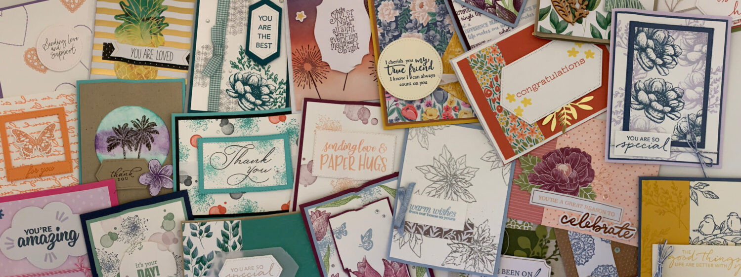
I went through my last batch of thank you cards for my customers. And with the recent launch of the new Annual Catalogue, of course I need some more. So this time I’m making some In Color thank you cards. I’m still getting used to some of the new colours and so I thought this would be a good chance to play with more than one of them.

The design for this card is this month’s creative challenge for my small team. There was also an extra piece this time… use at least on of the new colours. To keep it simple, I’m using a Basic Black card base for all of them. And instead of using the 2023-2025 In Color Designer Series Paper, I took a piece of cardstock and embossed it using the Timeworn Type 3D embossing folder.

On top of that layer I stamped on pieces of Basic White cardstock using the different In Colours and the Season of Chic stamp set. The “thanks” also comes from this stamp set. Then I die cut the sentiment using the Something Fancy dies and popped it up with some Stampin’ Dimensionals. Next I used a few of the different images from the same stamp set and die cut them with the coordinating dies. I wanted them on the same level as the sentiment so I popped them up too. And to finish them off I added a few of the coordinating In Colour Dots.

In Color Thank You Cards

I hope my customers like these In Color thank you cards!

Check out another thank you card I made a while back here.

And find the stamps, dies and In Colour products in my online shop.

Monochromatic Card with Patterned Paper

For most of my cards I use 2 colours, sometimes 3 or 4. But I also love a good monochromatic card. And crafting a monochromatic card with patterned paper is a simple way to make it really pretty. I just love the Hello Irresisitible Designer Series Paper! This is such a pretty pack of paper… and great for this kind of card.

To start I picked my DSP design. I chose a simple Pretty Peacock design and so I used that colour for my card base and ink colour too. This is such a pretty colour. I’m really glad Stampin’ Up! brought it back with the recent Colour Refresh they did.

On top of the piece of DSP I added a strip of Pretty Peacock cardstock. But first, to spruce it up a bit I did some tone on tone stamping with the ink splatter image from the Quiet Meadow stamp set. Then on top of that I added the sentiment. This one comes from the In the Moment stamp set. It’s of course stamped with Pretty Peacock ink too.

To finish off this simple card, I popped up the sentiment with a few Stampin’ Dimensionals. And then I added a few of the Flat Adhesive Backed Pearls. Don’t you just love the rainbow effect you get when these catch the light?!

Monochromatic Card with Patterned Paper

It’s so easy to craft a beautiful monochromatic card with patterned paper! All you need to do is pick a design. And right now there’s ALOT of options, so that’s probably going to be the hardest part.

Check out this other card I made using the online exclusive Hello Irresistible DSP here.

And check all the different packs of patterned paper that Stampin’ Up! has in my online shop.

Easy Wiper Pop Up Card

Fancy Folds Design Team

I wasn’t able to join last month’s blog hop, so I’m excited to get back to it! This month we’re making an Easy Wiper Pop Up card. I think we did something similar quite a while back, but this one was definitely easy! For all the measurements and step by step instructions check out this video from Jacque, a demonstrator from New Zealand (I’m pretty sure).

For my design I wanted to add some pretty Designer Series Paper. I just love the Hello Irresistible DSP! The colours and designs are so pretty. And I wanted to use a design I haven’t used yet. The one I chose has Daffodil Delight and Pretty Peacock as it’s colours. So I decided to use Daffodil Delight for my card base. I also used Daffodil Delight to stamp a few flowers using the Season of Chic stamp set and coordinating dies.

For the sentiment I stamped with Pretty Peacock ink. Then I attached it to a piece of Window Sheet which is attached to the mechanism that makes it pop up. And to finish it off I added a bunch of Rhinestone Basic Jewels.

Easy Wiper Pop Up Card

Check out the next Easy Wiper Pop Up card over on Mette Nordling Shaw’s blog here. And then be sure to keep hopping around the world to see them all!

And you can check out the similar wiper card that I mentioned earlier here.

Handmade Mother’s Day Card

Somehow this year Mother’s Day snuck up on me. In the past I’ve made some fun fold cards for my mom. But this year it just didn’t quite work out. I still managed to craft a pretty handmade Mother’s Day card though.

For this year’s card I used the Season of Chic stamp set and dies. I’ve had my eye on this one for quite a while and I finally added it to my collection recently. The images are great and so versatile. And there’s a nice variety of sentiments too. Both things I LOVE in a stamp set!

For colours I used Boho Blue and Wild Wheat from the new 2023-2025 In Colours. I also added a splash of Old Olive for the leaves. The flowers and sentiment I stamped in Boho Blue. Then I cut out the flowers, along with a few extra, with the coordinating die cuts. And popped up the flowers and sentiment with Stampin’ Dimensionals. I used Wild Wheat for the splotchy image. And I also used a piece of Wild Wheat cardstock with the Painted Texture 3D Embossing Folder for a little something more.

Handmade Mother's Day Card

If you want to add a little something more to this handmade Mother’s Day card, you could add a few of the 2023-2025 In Colour Dots.

I can’t wait to craft some more seasonal projects with these! In the meantime you can check out one my previous Mother’s Day cards here. And you can take a look at the Season of Chic stamp set in my online shop here.

Bottled Happiness

With all the excitement about the new Annual catalogue, it’s easy to forget about some of the great products that carried over. So this week I’m crafting with the Bottled Happiness stamp set. This is one of the first stamp sets I got from last year’s catalogue. Partly because I really liked the images and sentiments. But mostly because I loved the coordinating punch and shaker domes. I love a good shaker card! And so that’s what I’m sharing today.

For the shaker part of the card I’m using the Loose Frosted Dots, which is an online exclusive. So I looked to those for my colour combination. There are a few different colours I could use, but I decided to go with a “new” and and old colour; Pretty Peacock and Petal Pink.

I liked the sentiment “overflowing with happiness”, so I used that as inkspiration for my design. I stamped the bottle in the top left hand corner with Pretty Peacock ink. Then I used the splatter image from the Quiet Meadow stamp set to create the effect of the gems pouring out. First I stamped with Petal Pink and then with Pretty Peacock.

I had to be a bit creative in order to punch out my bottle. But I did it with a simple trim and reassembly. Once all the gems were inside the shaker dome, I added a few more o the card front using Mini Glue Dots. And the sentiment was framed with Pretty Peacock cardstock and then popped up with Stampin’ Dimensionals.

Bottled Happiness

The new colours are such a fun way to keep the inkspiration going with a stamp set like Bottled Happiness! Check out the card I made earlier this week on my Facebook page here using 2 of the new In Colours.

And if you live in Canada and would like a copy of your own Annual catalogue, contact me. I’d be happy to mail one to you… along with a few other goodies!

High Quality Craft Supplies

I do alot of crafting! And not just cardmaking. I also enjoy sketching, painting and working with clay. For some projects I love my local Dollarama and craft store. Especially for the projects I do with my munchkins. But for my cardmaking and scrapbooking I prefer to use high quality craft supplies.

This is especially true since I became a Stampin’ Up! demonstrator. Stampin’ Up! cardstock, inks and stamps are awesome! And they make it super easy to colour coordinate my projects. You can get cardstock, Designer Series Paper, ink AND markers all in the SAME colour.

What’s funny is that I didn’t even really notice until I picked up a pack of white cardstock from my local craft store to make some things for one of my munchkins birthday parties. When I got home I put the different cardstocks next to each other and WOW! I could see the difference. I could even kind of see the stamped image on the other side of the local craft store’s cardstock.

What’s even better is that as a Stampin’ Up! demonstrator, I get 25% off! When I first started it was 20% off. But it doesn’t take long to get to the next level and that 25%.

There are so many great things about being a Stampin’ Up! demonstrator. And the high quality craft supplies at a discount is just one! There’s also the sneak peeks, events and of course my team. I’m part of an amazing team of demonstrators! Some of us are hobbyists and some of us are working on sharing our love of crafting with others. But whenever we get together we have a great time. And they’re always there to answer any questions.

The same goes for me! Whether you want the discount or if you want to share, I’m here to support you in any way I can.

For more information on my team and what it’s all about check out my Join my team page here. And if you’re ready to join in on all the fun you can do that here!

Join my Team

Window Easel Card

I thought of a fun fold card to make once I started crafting with the new Beautiful Balloons bundle. I’m not sure exactly what it’s called, but I’m calling it a Window Easel card. It is an easel card. But I wanted to add a piece of window sheet to make it look like the balloons are floating. Hence window easel card. If it goes by another name, I’d love to know.

For my colour combination I’m using Misty Moonlight and Lemon Lime Twist. I’m so glad that Stampin’ Up! brought Misty Moonlight back! This was a favourite colour of mine back when it was an In Colour. I paired it with Lemon Lime Twist. Two nice bright colours that would help each other pop.

The sentiment inside the card comes from the Beautiful Balloons stamp set. But I cut it out with one of the Something Fancy dies. And of course to make sure the card would stand up like an easel I used a couple Stampin’ Dimensionals.

To add a little something else to the outside I added some of the Bright & Beautiful Designer Series Paper. The window panel hides on the inside of the card for a nice surprise. Plus the DSP hides some of the back of the panel that sticks out a little bit.

Window Easel Card

To finish off this Window Easel card I added a little bit of bling. Some Wink of Stella Glitterbrush to the balloons and a few of the Flat Adhesive-Backed Pearls.

Window Easel Card

Check out another card I made with the Beautiful Balloons bundle here. And to see ALL the great new products from the new Annual Catalogue, check out my online shop! You can also request your very own copy of the catalogue if you live in Canada and contact me. I’m happy to mail it out to you!

Beautiful Balloons

It’s here! It’s here! The new Annual Catalogue is here! I’m so excited that you all can finally see what’s inside. My pre-order finally arrived a little over a week ago and I’ve been having some fun with some of the new products. Right now I’m crafting with the new Beautiful Balloons bundle. I’ve been looking for a new birthday/celebration stamp set. So I was excited when I saw this one. It’s a great set for birthdays or any kind of celebration really.

For this card I wanted to use some of the returning colours that Stampin’ Up! brought back with the recent Colour Refresh. I still had Pretty Peacock and Lemon Lime Twist along with a couple other old In Colours that are now back. Pretty Peacock and Lemon Lime Twist are definitely not an obvious colour combination. But they do work well together. And just for fun, and an extra splash of colour, I threw in a little bit of Fresh Fressia. I’m so glad Stampin’ Up! decided not to retire this colour!

I stamped a few balloons and confetti in the background with the different colours. Then I did some tone on tone stamping with a piece of Lemon Lime Twist cardstock. I popped that up with a few Stampin’ Dimensionals and then layered on a tag and a couple extra balloons.

Beautiful Balloons

Beautiful Balloons is definitely going to become a favourite! I can tell already!

Check out my Facebook Live where I crafted this card here.

Want a copy of the new Annual Catalogue? Live in Canada? Then send me a message. I’d be happy to send one to you. There’s nothing like flipping through the pages of the catalogue!

Hues of Happiness

The Hues of Happiness Designer Series Paper has been my favourite patterned paper from this Annual catalogue. And I’m so sad to see the whole suite is retiring! So before it’s gone for good I’m sharing one last card.

I’ve actually managed to use almost all the paper from this DSP pack. So for my colour combination I started with picking a design from what I have left. The rainbow design offers lots of options. But I went with Gorgeous Grape and Melon Mambo, with a little bit of Pear Pizzazz. Gorgeous Grape is the card base to help the DSP and other elements really pop.

I stamped the large flowers and sentiment using Gorgeous Grape ink. And for the smaller flowers I used Melon Mambo. The leaves are of course stamped with Pear Pizzazz. Then I cut them all out using the coordinating dies for the leaves and flowers. I used one of the Something Fancy dies for the sentiment.

I layered the flowers and leaves straight onto the DSP. If you want, you can play around with this a little bit and pop up a couple of the flowers with Stampin’ Dimensionals. With this card just the sentiment is popping up. Then to finish it off I added two of the large Rhinestone Basic Jewels.

Hues of Happiness

While I’m sad that the Hues of Happiness DSP is retiring, I know it won’t last long! There’s lot of gorgeous paper coming in the new Annual catalogue that launches on Tuesday.

If you live in Canada and would like a copy of your own contact me. I’d be happy to send you one!

And don’t forget there’s still a few more days to get retiring products, or products that are increasing in price. Head over to my online shop before it’s too late!

#SimpleStamping Just Because

Before this month is done I want to make sure I do this month’s #SimpleStamping challenge! This month we’re making a #SimpleStamping just because card. A card to say ‘hello’. And this month we can use something extra. This month we can use a punch on top of the usual stamps, ink and paper.

This time I’m using some retiring products and colours for my card. Two of my favourite colours are retiring; Rich Razzleberry and Pear Pizzazz. I’m especially sad about Pear Pizzazz. That’s been my go-to colour for leaves and foliage. So I had to use it one more time with the Happiness Abounds stamp set (which is also retiring).

Rich Razzleberry is my card base. And Pear Pizzazz is my card mat. Then in the background I stamped a mix of Pear Pizzazz leaves and Rich Razzleberry flowers. I also added a splash of Boho Blue, one of the new In Colours from the upcoming Annual catalogue. Then along the centre strip of Rich Razzleberry cardstock I did some tone on tome stamping with the large flower.

To make this a simple card to say hello, I stamped “friend” in Pear Pizzazz ink. Then I punched it out with the scalloped oval from the Double Oval punch. And to add at least a little something to the card, I popped up my word with some Stampin’ Dimensionals.

#SimpleStamping Just Because

I enjoy making cards for all occasions, so to do some #SimpleStamping just because was pretty fun!

Check out the card I made for last month’s #SimpleStamping challenge here. It also features the Happiness Abounds stamp set.

And there’s only one more week to get any of the retiring products. Don’t miss out! See what’s still available before it’s gone for good in my online shop here.

Goodbye Mint Macaron

I don’t think that the last time Stampin’ Up! did a Colour Refresh I was this sad. Last time I remember being excited because they were bringing Blackberry Bliss back. But I don’t remember being upset about any colours retiring. This time is definitely different! And next week I’m going to feature some projects with my favourite colours that are retiring. For this week though I’m saying goodbye Mint Macaron. This is definitely been a colour I use a fair bit, so I’m a little sad to see it go.

For this card I paired it with the Love Cats stamp set which is what I’ve been featuring this week. So of course my other colour for my colour combination is black! The idea for this card design was sparked by a card my upline shared. I started with a Mint Macaron card base which I embossed with the Gingham embossing folder. Then I layered on a piece of Basic Black cardstock that I cut out using the Stitched Rectangles dies. I still can’t get over the fact that these are retiring!

On top of that layer is my kitty which I stamped using Tuxedo Black Memento ink. Then I die cut that with a smaller Stitched Rectangles die and wrapped some of the Black & White Gingham ribbon around it. The phrase is from the Friends are like Seashells stamp set. I stamped that with Mint Macaron and then popped it up with some Stampin’ Dimensionals.

Goodbye Mint Macaron

Usually I add a bit of bling to my cards, but this guy is just so cute I didn’t feel like it needed it.

Check out my card from earlier this week using the Love Cats here.

There’s still time before it’s goodbye Mint Macaron forever! Head over to my online store for the most up to date info on what’s still in stock. You have until May 1st!

Love Cats

There’s only a couple of weeks left before the new Annual catalogue launches! But before I start sharing new products I’m spending some time saying goodbye to some of the retiring products. Each week I’ve been featuring one or more retiring products in my projects and this week it’s the Love Cats. I’m pairing it up with this week’s sketch challenge from the Paper Craft Crew (PCC513). It’s a vertical sketch challenge…

Love Cats

I knew I wanted to use the Love Cats in the centre. So I tried to think of what would look cool behind it. I decided to use the Hues of Happiness Designer Series Paper. Another one of my favourites that I’m sad is retiring. Using Basic Black for my card base and ink colour, I thought the rainbow colours would really pop.

I used the Layering Circles dies to frame the kitty. Then behind that I put some gold metallic thread. I popped that all up with some Stampin’ Dimensionals. And to finish it off I added a few of the gold Pastel Adhesive-Backed Gems.

Love Cats

I’m so sad that Love Cats is retiring. But I’m probably more upset about the Layering Circles dies.

Check out last week’s card featuring the By the Bay DSP and Friends are like Seashells stamp set here. Last time I checked these were all still in stock, but it has been a couple of days so who knows now.

And don’t forget to check out all the other Paper Craft Crew challenge cards here.

Mystery Fun Fold

I found a picture of this mystery fun fold on Pinterest. It’s nice and simple! And I haven’t tried it before so I thought I’d give it a go. Plus it’s a fun way to show off some of the By the Bay Specialty Designer Series Paper that’s retiring very soon.

To figure out my colour combination I started with picking my DSP design. I love the main design I used for this card because it has a few different colours and I love all the seashells. When I was younger I loved exploring beaches looking for seashells.

For the card base I used Pool Party. I also used Pool Party ink for some tone on tone stamping. I wanted a little something behind the strip of Sahara Sand DSP. On top of the strip of DSP I stamped a sentiment from Friends are like Seashells in Petal Pink. Then I die cut the sentiment with one of the Something Fancy dies and popped it up with some Stampin’ Dimensionals. To finish it off I added a few of the Pastel Adhesive Backed Gems.

Mystery Fun Fold

If anyone knows the name of this mystery fun fold please let me know. And I’d love to see your versions if you give it a try.

Sadly the By the Bay DSP and Friends are like Seashells stamp set are retiring. To find out more about how the last chance sale works check out my post here. And the best place to see what’s still available is my online shop. Don’t wait! Things have been selling out fast! It’s been hard to keep up this time around.

2023 Retiring Products

Just last week Stampin’ Up! released it’s list of 2023 retiring products! This time of year is always bittersweet for me. I’m excited for the new products coming in the new Annual catalogue and I’m sad to see the retiring products go. And sadly there always seems to be a few that hit harder than others. For me this year that’s the Friends are like Seashells stamp set and the Layering Circles and Stitched Rectangles dies. The dies especially are ones that I use so often!

As always Stampin’ Up is making room for the great new products coming in the new Annual catalogue that launches in just 3 weeks. Plus this year Stampin’ Up! did a Colour Refresh. So some colours we’ve been used to seeing in the Annual catalogue are also retiring. A couple of my favourites are a part of this too… Rich Razzleberry and Pear Pizzazz. To help ease the pain of products leaving they’re offering up to 60% off!

I always say this when the list comes out, but this year it’s especially important. If there’s something on your wishlist that’s retiring don’t wait!!! After only a week ALOT is already sold out! Thankfully there’s still lots that’s available. But there’s no guarantee that things will still be available on May 1st (the last day of the sale).

In my more than 10 years as a Stampin’ Up! demonstrator I’ve never seen retiring products sell out so fast! So don’t wait until all the 2023 retiring products are gone! For the most up to date information on what’s still available check my online shop. I just can’t keep up with it this year!

Check out the card I shared last week that features some retiring products that are still available here.

2023 Retiring Products

Goodbye Polished Pink

For the past few weeks I’ve been featuring the 2021-2023 In Colours to get ready for this. This list of retiring products is now officially out! And that means it’s officially time to say goodbye Polished Pink. I’ll talk more about the list next week, so stay tuned. And over the next couple of weeks I’ll be featuring some of the retiring products in my projects. But if there’s something you really want, don’t wait! Things are selling out already!

For this card my main colour is Polished Pink, of course. And I’m pairing it with one of my favourite colours Blackberry Bliss. This is a bit of an unlikely colour combination but it works. Polished Pink is definitely a colour that’s had me scratching my head at times to figure out what to pair it with. And now that I’m getting the hang of it, it’s retiring. Grr!

The images I’m using for this card are also retiring. I’m really sad that Butterfly Brilliance is retiring (dies too), but I’ll be holding on to this one. I stamped the butterflies in Polished Pink and the sentiment too, which is from Something Fancy. To keep Polished Pink as the focus I used Blackberry Bliss mainly as a background colour. Including the typed text from Quiet Meadow.

To add a little something more to the card I also embossed the piece of cardstock with the stamped text using the Timeworn Type 3D embossing folder. Then on top of that, and the butterflies, I used one of the Something Fancy dies to frame the sentiment. To finish it off I popped up the sentiment and added a few Rhinestone Basic Jewels for a little bling.

Goodbye Polished Pink

While I’m sad that it’s time to say goodbye Polished Pink… and Butterfly Brilliance, I’m excited for the new catalogue. And I can’t wait for my pre-order to arrive so I can start sharing some new projects with you!

Check out a couple more retiring colours here. I can’t believe that Pear Pizzazz is retiring too! This summer is going to be a busy one with purging and reorganizing my craft stash!

For the latest on what is still in stock from the retiring list, check out my online shop. I’ve never seen things sell out this quickly before so don’t wait!!